
The Lens
How the same timetable is drawn — pivoting the axes, the detail slider from heat map to full detail, colour, and overlays.
Lens changes how the timetable is drawn. It never changes what it contains and never changes what you can see — that is Filter's job. Everything here is about legibility.
It has five sections.
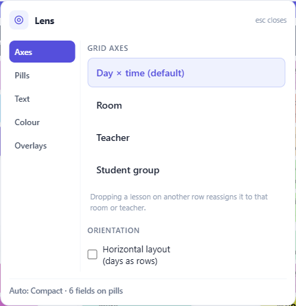
Axes — what the rows and columns are
The default grid is day × time. You can pivot it so the rows become rooms, teachers or student groups instead, with the week running across.
That is a genuinely different question. Day × time asks what is happening on Tuesday? A room pivot asks what does Lab 2 do all week, and when is it empty? For checking one resource's load, the pivot is far quicker than filtering to it and reading a mostly-empty grid.
A pivoted grid stays editable, and dragging in one means something slightly different: dropping a lesson on a different row reassigns it to that row's room or teacher, as well as moving it in the week. That is often exactly what you want — this lesson should be in Lab 2 instead is one drag rather than an edit — but it is worth knowing before your first drag in a pivot.
Orientation flips days and periods, putting days down the side. Some schools read a week that way round; use whichever matches the paper timetable everyone already knows.
Pills — how much each lesson shows
The detail slider runs through five steps, and it is a continuum from most information to most overview:
- Full detail — everything you have switched on
- Compact — the subject plus one secondary line
- Overview — subject codes only
- Colour blocks — no text at all, just the shape of the week
- Heat map — no lessons, just how busy each slot is
The bottom two are not degraded views; they are the ones that answer where are the gaps on a timetable too dense to read. Dropping to colour blocks makes a pattern visible that full detail buries.
By default this is automatic — the app fits the detail to the space it has, and the label tells you what it chose. Move the slider and you take control of it. Ctrl with + and − steps up and down; Ctrl+0 hands it back to automatic.
Underneath, you choose which fields appear on a pill at all: the full subject title, the teacher, the groups, the room, comments and activity tags. Fewer fields means larger, more readable text at the same size — worth remembering before you decide the grid is too small.
Text
Each field switched on above gets its own size control here, so you can make the subject large and the room small rather than scaling everything together.
A field only appears in this section when it is switched on in Pills.
Colour
Three palettes.
Classic gives each subject a vivid, distinct tone. Accessible uses a colour-blind-safe palette — this is not a lesser option, it is the right choice for a timetable that goes on a wall or a screen where you do not know who is reading it. Auto picks between them by size, using the accessible palette for small timetables and the classic one for large ones, where the number of subjects outruns any safe palette.
Two rendering switches sit alongside. Coloured background fills each pill with its subject colour; turning it off draws every pill on a plain neutral background instead, which is the calmest way to read a very dense week. The second decides whether icons are drawn.
Overlays — things drawn on top
Today's substitutions overlays today's absences, cover and room changes on the ordinary grid. It is an overlay rather than a mode, deliberately: you are still looking at your timetable, with today's reality painted over it.
Blink conflict badges makes clash badges pulse. Off by default, because motion is tiring on a screen you stare at all day; on when you are hunting conflicts and want them to declare themselves.