
The timetable view
The main screen — what the grid shows, the three controls above it, the unassigned drawer, and the menu everything else lives in.
The timetable view is where you look at the week and move things around. The data screen holds the ingredients; this is the finished dish, and it is editable.
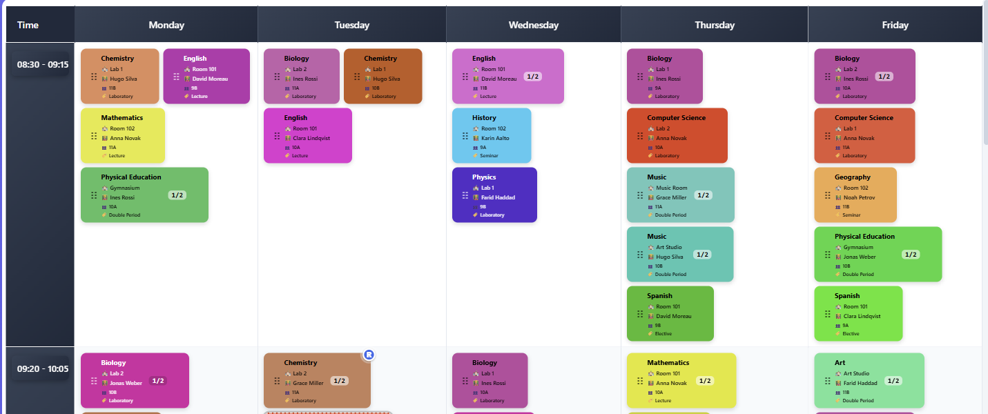
By default the grid runs days across and periods down, with each lesson drawn as a coloured pill. The colour is the subject's, so a week becomes readable long before you have read any of the words on it.
That is what an ordinary timetable opens on. A large one — past roughly a hundred placed lessons — opens in Browse instead, showing one teacher's week at a time, because a week that dense is not readable as a whole. It is an ordinary task rather than a different app: the Task button names it, and Exit gives you the grid above. See Browse mode.
Three controls, and only three
Above the grid sit Filter, Task and Lens. They are deliberately few, and each answers a different question:
- Filter — what should I see? It removes lessons from view.
- Task — what am I doing? It changes how the app behaves.
- Lens — how should it be drawn? It changes the picture, never the contents.
The distinction is worth internalising, because it tells you where to look for anything. Hiding Friday is a Filter. Making the pills smaller is a Lens. Planning one lesson is a Task.
Only one task runs at a time — starting one ends the last — and the Task button always names the current one, including Editing, which is a real answer rather than a blank.
The command palette
The search button, or Ctrl+K, opens a palette that does two things: it runs commands (start the planner, browse, show today's substitutions, clear filters, full screen) and it jumps to a lesson by name.
It is not a filter. If you want to narrow the grid, use Filter — the palette takes you to things, it does not remove them.
The unassigned drawer
Lessons that have not been placed yet collect in a drawer beside the grid, ready to be dragged in.
It follows the view you are in. In the ordinary day-and-time view it holds lessons with no day or period. Look at the timetable by room and it holds lessons with no room; by teacher, lessons with no teacher. In each case it is answering the same question — what is still unassigned on the axis I am looking at — and the heading and count change to say so.
That has one consequence worth knowing. A lesson that has a teacher but no time slot is assigned on the teacher axis, so it leaves the teacher drawer without being finished. Rather than quietly hide it, the panel keeps a line saying how many activities still have no day or time, with a link to show them. An empty drawer stays a trustworthy signal that you are done.
The menu
The menu in the header holds everything that is not a view control, grouped by what it does to your data.
Getting data in — importing activities from CSV, or uploading a .fet file. Both are marked with what they replace, because both replace something.
Getting data out — downloading .fet (checked before it is produced), exporting a PNG or CSV, and printing by room, teacher, student group or activity tag.
Below those sit your substitutions, the timetable's settings, and full screen — which Esc exits.
Light and dark
The account menu in the header carries a three-way colour setting: Auto, Light and Dark.
Auto is the default and follows your device. If your phone or computer switches to dark in the evening, the timetable follows it without you doing anything. Light and Dark override that and stay put, which is what you want if your device is set one way and you prefer to work the other.
The choice is remembered in the browser you made it in, not on your account. Setting dark on your laptop leaves your phone as it was, and a colleague opening the same timetable sees their own setting rather than yours. It is applied before the page is drawn, so switching pages never flashes white on the way.
Two things it deliberately does not touch:
Printing is always light. A dark sheet would empty a toner cartridge and read badly on paper, so the print designer ignores the setting entirely — what you see in the print preview is what comes out, whichever theme you are working in.
Wall displays have their own setting. A board is configured for the room it hangs in rather than for you, so its light, dark and high-contrast choice lives with the board — see Running a screen on a wall. Changing your own theme here does not change what is on the wall.
Conflicts
When a placement clashes, the pill carries a badge. The badge is a summary; the full report is a separate screen listing every problem by kind, and it is covered in its own page.